Data has always been important to the people-focused elements of a business; never more so than now in the age of big data.
Every HR/people strategy team I know is in search of finding that right alchemy of data that, if providing those right insights and used properly, will aid us in creating predictive models and proactive changes to our work. And yet, while we rush to hire operations people to tease out this vital information and invest in tools to automate and accelerate finding answers, many of us are only focusing on half the picture. It’s one thing to have data, but you need to be able to communicate it in a way that is influential and meaningful. In other words, both you and your data need to be able to tell a story.
Here’s my recent personal struggle. Over the years, my team has curated a set of data that really digs into the basics our board and leadership care about; attrition, retention, highlights on our sales team, etc. And while I’m proud that we’ve assembled a solid set of information they find valuable, it’s just not good enough for me. Given our rapid growth, we don’t have a lot of trend data. Each quarter, a group of us dissect the information we’ve collected, analyze it, and then align on what story it’s telling us. It’s quite manual and takes a lot of effort. This data analysis and storytelling should work in conjunction with one another, and the flow of information should work seamlessly together - or at the very least, complement each other.
Being able to supply the right data and analyze it meaningfully is one skill set we all need, but so too is the ability to tell an effective story about it. Sound daunting? It doesn’t need to be. Think of it like making a good pasta sauce.
Do you start cooking your sauce before you have all the ingredients for it? No.
Do you cook the pasta before you’ve made the sauce? No.
Do you taste the sauce before it’s simmered? Sure...but primarily to test and edit it.
In other words, there is a method to storytelling. You start with the foundational elements - like browning the garlic in olive oil - and build from there. You add the tomatoes, and you carefully add in the basil and oregano to taste. By building one step at a time, your story (and your sauce), each piece will be supported by the elements that came before it. Sounds simple, right? Let’s lay it out a little more.
SHARE YOUR ASSUMPTIONS
Not all data can illuminate all answers. Every model has some assumptions baked in, and it’s important to call those out. For example, if you are reviewing survey data, you may make some assumptions about having used a representative sample of information. In other words, share your model and state your hypothesis - similar to high school chemistry class. It gets everyone on the same page about the starting place.
BUILD THE FOUNDATION
Since you’ve shared the basic model and assumptions your story is being built upon, it’s important to next share some details. This might include what it is you are analyzing (e.g. attrition trends in account executives), what each of the variables mean (e.g. the data that supports your model) and why you think it’s important to analyze this information in the first place (e.g. we are seeing attrition go up...we want to dissect why this might be happening).
SHARE THE INITIAL FINDINGS
While a beautifully crafted model can look impressive, it’s not enough to stand alone. To accompany it, you’ll need to share what analysis you’ve done with the data and why you did it. You’ll also need to share that you’ve learned from this exercise.
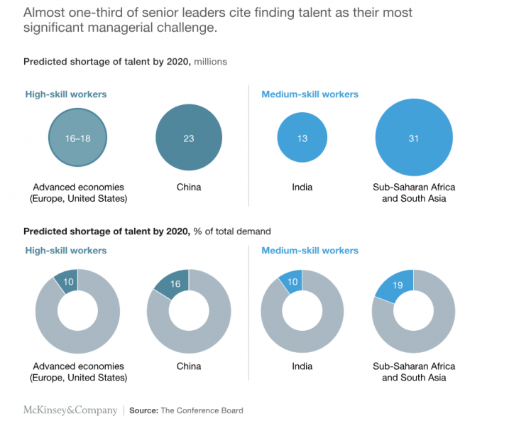
This is where pictures come in. We all learn and understand differently. Whether it’s through numbers or pictures, a balance is important. A concise graph or table can save you a lot of time in explanation. If you don’t have the skills or talent to create this on your own team, there are a ton of examples available for free with a simple search. There are also a multitude of affordable classes that can help.
ISN’T THIS MORE IMPACTFUL THAN JUST SHARING A BUNCH OF NUMBERS?!

Continue to share your additional pieces of data. Whether it’s looking at the information from another vantage point or digging a little deeper, you are adding more ingredients to your story to create a more comprehensive picture.
In addition to sharing your findings, you should include your interpretation of this data. For example, “I believe this analysis is accurate based on …” or “I have interpreted these finds to mean…”
SUMMARIZE
If you’ve created a strong story to accompany your data, it should be fairly simple to comprehend. Pull it all together with a crisp summary about what you’ve analyzed and your key findings, highlighting your big conclusions. You want to be able to have people understand the context and the big picture; not just zero in on one or two data points.
Bottom line: No one wants to present a whole bunch of data and have it fall flat. You want the people you share it to walk away educated, and enlightened about what you’ve shared. I know when I am trying to cook something new, following a recipe helps guide me in the right direction. However, when it’s complemented with a picture of the finished product and even a little context about what inspired the dish, I feel far more prepared to create something delicious.

